
Jessica Helfund expresses her great distaste of what "posters" are becoming in the design world. She describes the long history of this informative artwork and how it portrays the social and cultural values of a generation. There are 4 basic points of poster design that are described:
1. Increased Participation by Scholarly Society Members (audience)- going through a rigorous editing process makes everything better, not just posters. Also, knowing your audience and designing clearly for them is essential.
2. For many researchers, the poster format is superior for the presentation of their data. (form and content) - "poster" is being referred to anything that is 8.5x11 and hung on a bulletin board, without any regard to the content. All posters are different, even if addressing the same product. Combining form with function and style with substance creates something unique in its time.
3. The individual presentation time of a panel, i.e. 15-20 minutes is often not enough time. (scale) - posters are most effective when they are large, there is actually a physical reaction from the viewer. Small posters work too, they show amounts of detail in the hands of a skilled designer.
4. Poster sessions are a consideration to foreign colleagues. (audience) - basic rules apply to all types of posters: Content. Form. Scale, Audience. Typography. Image. Hierarchy. Composition.
She finishes by asking students to team up with scholars in the humanities to volunteer and practice their craft in order to improve it; all while doing good for the community.
0

Posters in Progress
So when trying to design a poster for the final, this was my initial design...


This one (so far) is a lot cleaner and gives off the type of feeling I'm going for.

But I'm feeling like that's a little too busy, so I have been working on a second approach:

 Posted by
sgoetz
Posted by
sgoetz

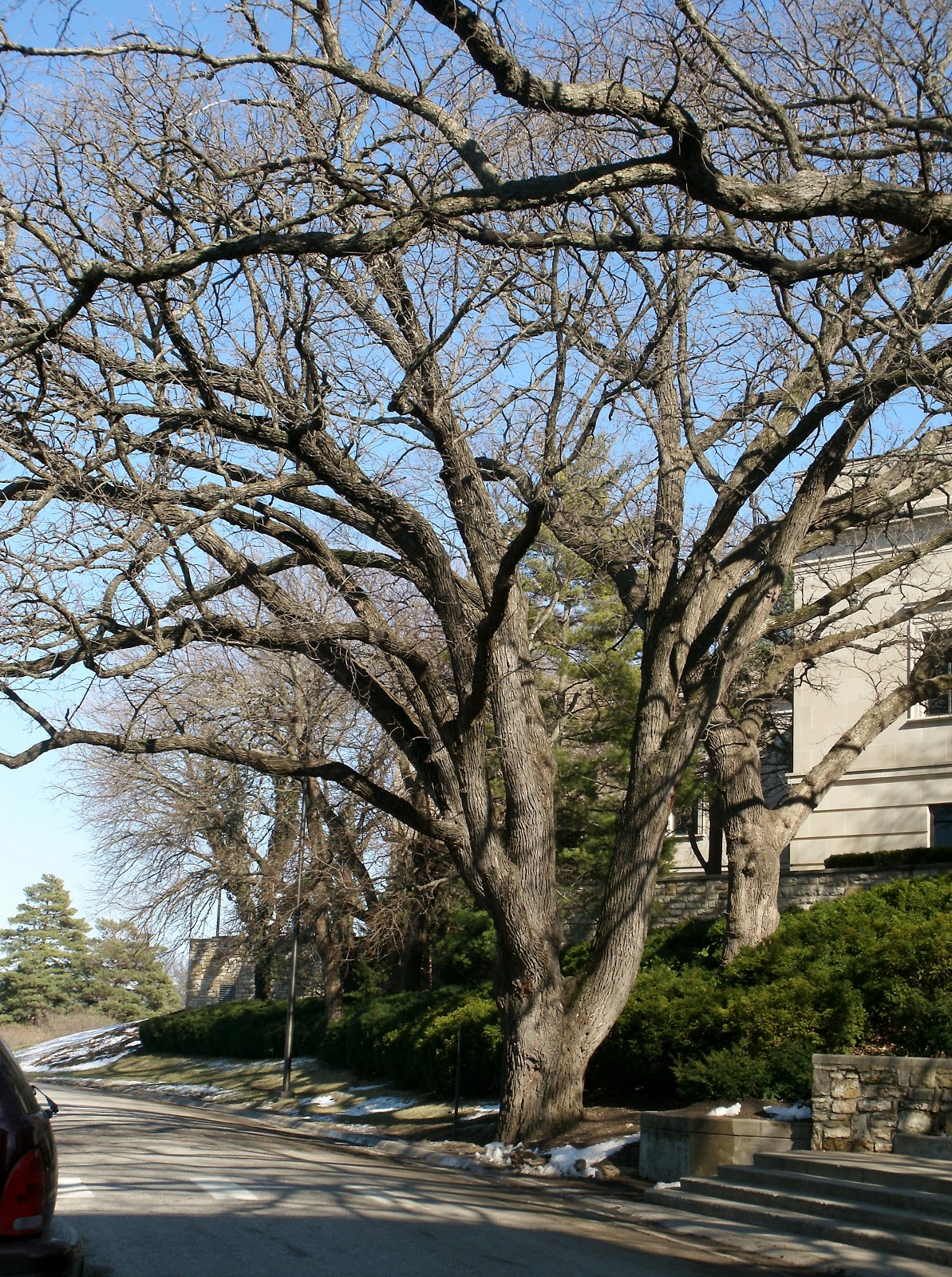
Trees!
While searching for potential candidates for my treehouse, here are some photos of trees...


 Posted by
sgoetz
Posted by
sgoetz
Wayfinding Solution Images
I created a quick SketchUp model of the parking garage that we are using and incorporated our solution of red tape on the floor and signs at the nodes. Here are some images from that model...
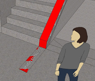


On the 2nd floor, the beginning of our solution system...

...Looking up the stairs and seeing the next sign...

...Between the 3rd and 4th floors...

...Looking down the stairs from the 4th floor...

...and finally! The tunnel entrance to the Kansas Union :)
Posted by
sgoetz
Wayfinding Readings
To assist us in further representing and analyzing our situation, each of the members of the group completed some reading. Here are the summaries of the clips I read from Lynch and Verplank.
Lynch – The Image of the City
· Five elements of a city: paths, edges, districts, nodes, and landmarks
· Paths – how people move through the city. Streets, walkways, railroads, etc.
· Edges – boundaries between two places, linear breaks in continuity. Shores, walls, etc.
· Districts – sections of a city that an individual enters “inside of”. Identifiable from the outside as well as the inside.
· Nodes – cores of a district, junctions and/or concentrations of paths. Crossing or convergence of paths, enclosed square, street-corner hangout, etc.
· Landmarks – external type of point-reference. Building, sign, store, mountain, etc.
· Elements constantly overlap and some are multi-purpose
· Users create a mental image of the city. The better designed the city is, the better image quality users have and the easier it is to navigate.
· Environment should be organized to satisfy the individuals who inhabit it; different cultures have different needs.
Verplank – How do you KNOW?
· Path knowledge – step by step instructions expected by the user
· Map knowledge – Lynch’s belief of mental maps, “imageability”
· Imageable cities have paths along edges, and/or landmarks at nodes to be used for navigation.
· Applies Lynch’s ideals to modern technology, including a computer mouse, web pages, and a music synthesizer keyboard.
Posted by
sgoetz
Expressive uses of paper
For this last project, we have been using computer and bristol paper to create different "skins" that might look interesting with light. Learning how to use the texture and opacity of these materials has been interesting and the classes have come up with some pretty interesting ideas. We are now working on how to connect our panels together, which is probably going to be the toughest decision of the project, including how we attach it to the light bulb without the paper actually touching the bulb. Here are a few photos of our first run-through of skins made of computer paper:


Here are some of my improved skins made of bristol:


 Posted by
sgoetz
Posted by
sgoetz


Subscribe to:
Posts (Atom)


